Information Foraging, Berry-picking, & Information Scent
A major part of being an Internet user is searching for information. We often do this prior to landing on a website (for example, after querying a search engine), and we do it within a website, to find the pieces of information that are of interest to us.
Web pages are connected through hyperlinks, and together, they comprise hypertext — interconnected text that can be navigated and consumed by branching out from one's current position in the text. Hypertext with its embedded hyperlinks is the mechanism that allows us to navigate information spaces not just linearly, as when reading a book, but in a way more akin to traversing a physical space.
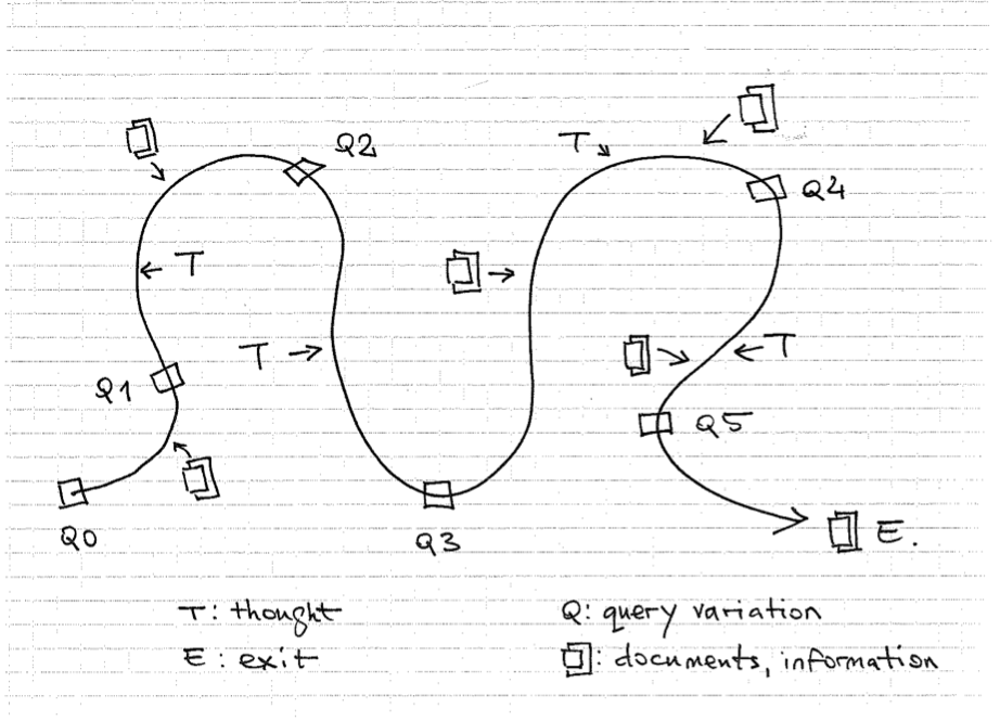
A good illustration of how hypertext works is searching for items of interest with the help of a search engige. We do an initial search, then match the results against the intent of our query. While at this stage, we also pick up extra tidbits of information that allow us to refine our query — or even to restate it by phrasing it differently. Then, we search again using this updated query, and browse through the new results picking up new cues. Alternatively, we may dwell on a particular result for some time, studying its meaning. We repeat this “search – gather cues – search” loop until we find what we are looking for — or stop browsing for any reason.
In other words, we search and consume information in iterations. First we search for something and pick a result that seems to best satisfy our query. As we explore this piece of information, we develop a new understanding of the problem. Our existing knowledge of the subject is augmented with new detail. This enables us to refine the query and formulate a new one (or several branching queries) in a way that is more detailed and precise. With each iteration of searching and gathering, we are able to “circle in” on our subject of interest closer.
This pattern is called “evolving search”, or “berry-picking” – because it closely mirrors hunter-gatherer behavior when searching for food.1 In fact, our information-searching behavior has evolutionary roots. Our brain uses the same decision mechanisms when searching for information that we have developed over millennia when foraging for real food.2

The process is called information foraging, and is closely related to the concept of information scent. Information scent is based on our internal judgment about the likelihood of finding something of value if we pursue a certain path within an information space (such as a website). Headlines, navigation items, design elements that stand out, text copy, calls to action, visual conventions such as icons – such elements send signals to our subconscious about how close we are to our item(s) of interest. As we navigate an "information path" by clicking various items, we are comparing what we find with what we had expected to find. As long as our expectation is confirmed, we move further along the path. When the cues get weaker, we perceive it as decreased probability of finding additional useful information. In that case, we either:
- pursue a different branch of our original query;
- modify the query to include whatever information we have gathered so far;
- quit searching.
To generalize, finding information online happens in two modes:
- searching — when we know what we want to find beforehand;
- browsing — when we may not know what we want to find beforehand.
Findablity is curious phenomenon. When we first start searching, we are looking for what we know we don't know. But in the process, we discover valuable things we didn't know we didn't know. Cumulatively, these things change us — how we think, what we buy, and who we become.3
When making a website, brainstorm ways in which you can support both these findability modes – the intentional, targeted kind (search) and exploratory mavigation (browsing).
Web Pages and Their Focal Points
Web pages exist on a spectrum between two extremes:
text-only <---------------------------------------------> multimedia-only
An example of the first: look at any Kindle e-book. What you see is a single column of very readbable text; nothing more. Or, take any web page and view it in your browser's distraction-free (reading) mode; same thing. As we shall see, this user experience — the processing of a single, continuous block of text — is the foundation of all web design.
Examples of the second category are full-screen video, animation or virtual reality.
Most web pages fall somewhere between these two categories. Let's look at two examples: the text-only page and the mixed-media page.
How we process text-only pages
Take any page that mainly features homogenous text (like a results page returned by a search engine, a typical Wikipedia entry page, a long-form narrative, etc.)
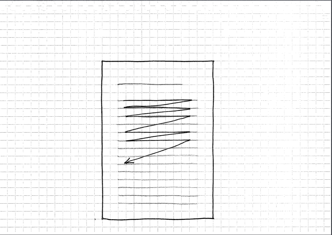
In the absence of other strong design elements, our eyes will default to processing the page in a zig-zag pattern: left to right and top to bottom.

This eye movement pattern is conditioned by reading direction, which in turn is culture-specific. In languages such as English, text is read left to right and top to bottom; through performing many repetitions of this movement, our eye muscles get facilitated to follow this path when processing text.
In other languages reading is done right to left (Arabic) and top to bottom (Chinese); this has an effect on perceptual span4 and hence the design aesthetic. Cumulatively, these factors may even have influence on cognitive styles5.
This covers the basic example. However design can be used intentionally to "guide" a user through a page. What happens when consuming a more complex layout?
How we process complex layouts
Most web pages tell stories through a combination of media. Chunks of text alternated with images and multimedia, grouped together in a sequence of sections, making up a narrative.
When dealing with a page like that, the foremost task is to establish a clear information and design hierarchy. Our eyes are first drawn to those elements of the page that stand out because of their visual weight. Visual weight is achieved by giving an element contrast; this can take several forms:
- the element's size is different from the surrounding ones
- the element has a color that contrasts with the background
- it has a shape that makes it distinct
- a combination of the above.
These islands of bigger visual weight create the focal points of the design — places that stand out because they contrast against their backgound, and stand out within their context.

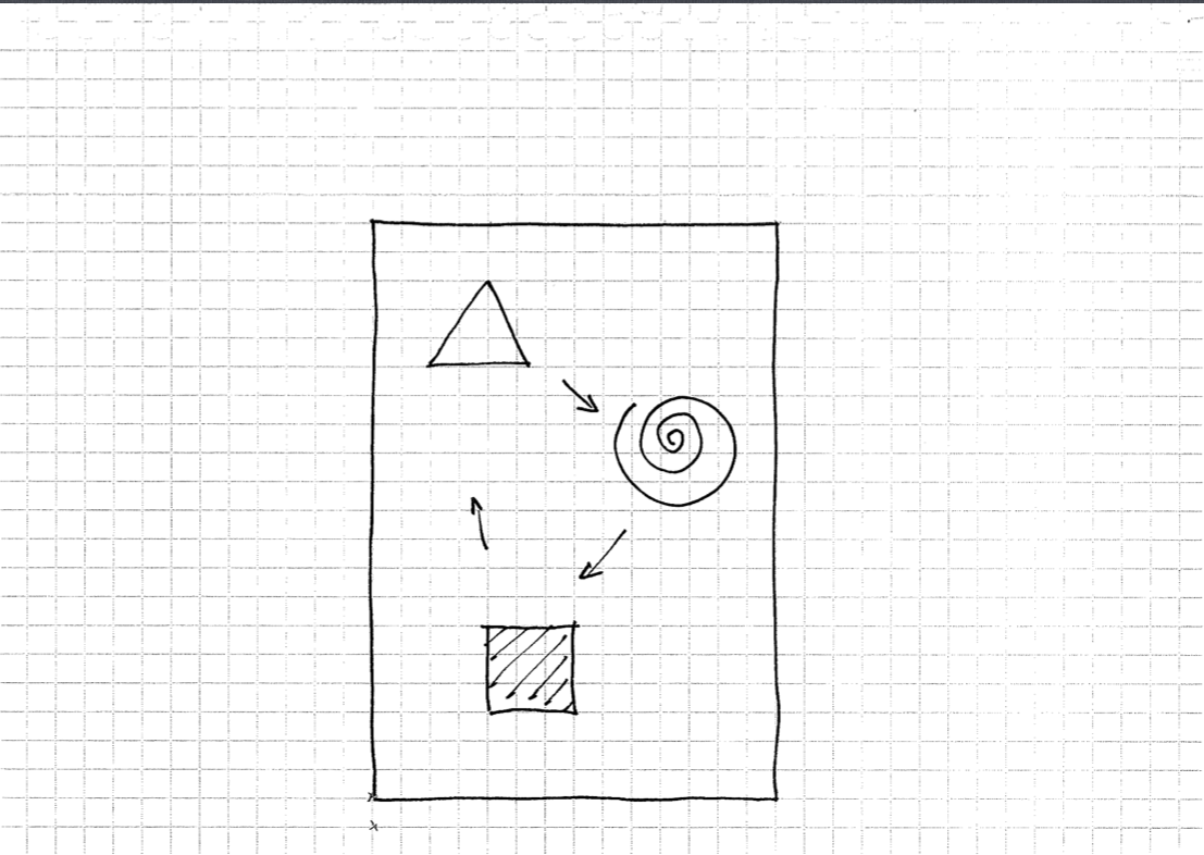
When such focal points are present, our eyes move through page by going from one focal point to next, from top to bottom of the page. This is used by designers to craft storytelling-type experiences, in which the user's attention is guided through a page one impression at a time. In a way, the focal points override the zig-zag pattern of reading, because they make our eyes move between the focal points first.
Reading
Early on in the history of the web, studies have been performed to compare online reading to offline counterpart. Notably, in 1997 Jakob Nielsen performed usability studies that showed that users generally don't read online, but scan web pages with quick eye movements and a lot of jumping from point to point.6 His studies also showed that reading online was 25% slower than reading on paper.7
Two things are worth noting about this study:
First: the websites weren't selected to reflect the study participants' interests. It's not clear how having more interest in the subject matter would have affected the control group's reading patterns.
Second, the reading experience on electronic devices has much improved since the time of the study. Screens today have higher resolution and font rendering is better. Especially tablets (Kindle and the iPad) approximate the speed of reading on paper. Reading is slowest on PCs, just as it was at the time of Nielsen's original experiments.8
Despite these caveats, it is advisable to observe best practices when writing for online consumption. It's best to assume that your readers' working memory is already taxed and that many other factors are competing for their attention right now. Your content will be more user-friendly if you employ the following writing style:
- Short paragraphs with a single idea or message
- Sentences that give the facts (objective information) up-front
- Headlines that reveal the content of the following paragraphs
- Text that is logically grouped into short sections and subsections
- Liberal use of lists and summaries to convey the main points.
Nielsen advises9 to use "half the word count (or less) than conventional writing"; that's probably a good rule of thumb to go by. Brevity and clarity are attributes of good writing — regardless of the medium.
Types of Memory and Information Processing
According to a well-established theory, we have two kinds of memory10. Long-term memory is the deep, broad and interlinked repository of knowledge and experience we have accumulated over the course of our life. Short-term (or working) memory is the intermediate “buffer” in which we hold things at hand while working on some task.
From short-term memory, we either transfer these temporary items to long-term memory (given the right combination of motivation and repetition), or we discard them. (A computer's memory is organized in much the same way, with the hard drive playing the role of long-term memory and RAM functioning as the short-term counterpart.)
Long-term memory is almost unlimited; by contrast, short-term memory is both limited and transient.
Many studies have been performed to determine the number of items that a person is capable of holding in their short-term memory.11 A classic study from the 1950's found it to be 7 +/-2;12 a more recent study found it to be 4.13 Determining this is not straightforward, as there are important factors that affect our cognition at any given time: how the items are categorized (or relate to each other); our previous knowledge of the items; etc. What is clear that the short-term memory is finite, and easily lost.
Several studies conducted on web surfers demonstrate that short-term memory is negatively affected by all elements except plain text. Even links in web pages have a distracting effect — not to mention multimedia.
In one study, the participants were asked to read a piece of online text with a varying number of links. They were then asked to write a summary of what they had read. The study found that as the number of links increased, comprehension decreased — whether the person clicked the links or not!14 This is because the act of deciding whether to click a link introduces its own mental processing overhead which diverts resources from the main task.
In another study, more than 100 volunteers watched a browser-based presentation about the country of Mali. One group watched a text-only version, the other a version that used video along with text. Afterwards, the participants were quizzed on the material. Those who watched the text-only version not only answered significantly more questions correctly; they also found the presentation to be more educational and enjoyable!
Multimodal Perception
So human information processing ability appears to have a natural bottleneck. This becomes even more evident when we try to perform two demanding tasks together as opposed to in isolation. One explanation is the fact that attention-demanding tasks rely on working memory, whose capacity is limited.15
There seems to be one exception to this: multimodal perception. Information can be communicated through different sensory channels — visual, auditory, and tactile. Certain combinations of these channels yield good results with regards to learning — as long as this happens concurrently.16
Multimodal presentation has two main constraints:
The split-attention effect states that the brain can only encode inputs from multiple senses in parallel. Hence, the feeding of information through multiple channels must be done simultaneously17; sequential presentation will not work.
The redundancy effect is an exception to the split-attention effect. Presenting someone with redundant information simultaneosly will increase cognitive load18 without adding to information gain.
(Caveat: What someone perceives as being redundant depends on their expert status.)
For example, reading text on a slide while the same text is read to you out loud creates a redundancy effect. This can be avoided by:
- using text sparingly on the slide
- using images to stand in for textual explanations19
- using vocal narrative to complement the slide's content, rather than duplicating it.
NB: The exact mechanisms behind both the split-attention effect20 and the redundancy effect21 remain a topic of ongoing research.
Take-aways for the webmaster
We hunt for information, gather cues, and hone in closer to our goal. In the process, we use the gathered cues to refine the original query. Information foraging is similar to ancestral food foraging.
Navigating information spaces (reading, searching, browsing, jumping between pages) relies mostly on short-term memory. It's therefore important to understand how this affects our cognition and comprehension of online material.
Designing for the web is very much like designing a presentation deck. Each screen can be viewed as a slide, forming a series of slides constrained by the browser's viewport.
Separation of media types works great for increasing focus. If you want your visitors to pay maximum attention, give them one type of media at a time. The extreme example of this would be one single, stand-alone, link-free piece of writing – with nothing more on the page.
So the ultimate web design is a text-only page. Obviously, we cannot build all pages this way; links and multimedia are important parts of the medium. Indeed, without hyperlinks there would be no web and video can be used to great effect (more on this in a later chapter).
The trick is learning to organize text, links, images, and multimedia around messaging priorities — so that these element work together in a synergistic way instead of competing for the user's attention.
I suggest this process:
- Decide on a message using text.
- How would the same piece of content look if it was created using images or video?
- Then create alternate versions to support the text. Don't duplicate information.
- On a single screen, use no more than two different media to convey the same message.
In other words, use media types to complement each other.
Designing e-learning / multimedia requires a different approach than designing web pages; make sure you understand the best practices.22
-
The design of browsing and berrypicking techniques for the online search interface, by Marcia J. Bates, (1989). Online Information Review, Vol. 13 Iss: 5, pp.407 – 424. http://pages.gseis.ucla.edu/faculty/bates/berrypicking.html ↩
-
Information Foraging, Peter Pirolli and Stuart K. Card. UIR Technical Report Funded in part by the Office of Naval Research. January 1999. http://act-r.psy.cmu.edu/papers/280/uir-1999-05-pirolli.pdf ↩
-
Peter Morville: Ambient Findability: Findability Hacks. A List Apart, October 11, 2005 — https://alistapart.com/article/ambientfindability/ ↩
-
Reading direction and the central perceptual span: Evidence from Arabic and English. Jordan, Almabruk et al. Psychonomic Bulletin & Review, September 2013. https://www.researchgate.net/publication/257071931_Reading_direction_and_the_central_perceptual_span_Evidence_from_Arabic_and_English ↩
-
Reading direction and culture. Shihui Han & Georg Northoff. Nature Reviews Neuroscience, December 2008. https://www.nature.com/articles/nrn2456-c2 ↩
-
How Users Read on the Web, Jakob Nielsen 1997. http://www.useit.com/alertbox/9710a.html ↩
-
Why Web Users Scan Instead of Read, Jakob Nielsen 1997. http://www.useit.com/alertbox/whyscanning.html ↩
-
iPad and Kindle Reading Speeds, Jakob Nielsen 2010. http://www.useit.com/alertbox/ipad-kindle-reading.html ↩
-
How Users Read on the Web, Jakob Nielsen 1997. http://www.useit.com/alertbox/9710a.html ↩
-
Neuroscientific Evidence About the Distinction Between Short- and Long-Term Memory. Derek E van Nee, Marc G. Berman, Katherine Sledge Moore, and John Jonides https://www.ncbi.nlm.nih.gov/pmc/articles/PMC4226135/ ↩
-
The Magical Number Seven, Plus or Minus Two. Wikipedia, the Free Encyclopedia. http://en.wikipedia.org/wiki/The_Magical_Number_Seven,_Plus_or_Minus_Two ↩
-
Miller, G. A. (1956). "The magical number seven, plus or minus two: Some limits on our capacity for processing information". Psychological Review 63 (2): 81–97. http://www.psych.utoronto.ca/users/peterson/psy430s2001/Miller%20GA%20Magical%20Seven%20Psych%20Review%201955.pdf ↩
-
Cowan, Nelson (2001). "The magical number 4 in short-term memory: A reconsideration of mental storage capacity". Behavioral and Brain Sciences 24 (1): 87–114; discussion 114–85. ↩
-
Hypermedia Interface Design: The Effects of Number of Links and Granularity of Nodes. Erping Zhu, Florida Gulf Coast University. http://www.aace.org/pubs/jemh/v8n3.htm#Hypermedia%20Interface%20Design:%20Th ↩
-
Cognitive Load — Wikipedia. https://en.wikipedia.org/wiki/Cognitive_load ↩
-
"Multimodal Perception: When Multitasking Works", by Graham Herrli. A List Apart August 25, 2015. https://alistapart.com/article/multimodal-perception-when-multitasking-works/ ↩
-
Split-attention Effect — Wikipedia. https://en.wikipedia.org/wiki/Split_attention_effect ↩
-
Jin, P. (2012). Redundancy Effect. In: Seel, N.M. (eds) Encyclopedia of the Sciences of Learning. Springer, Boston, MA. https://doi.org/10.1007/978-1-4419-1428-6_200 ↩
-
Picture Superiority Effect — Wikipedia. https://en.wikipedia.org/wiki/Picture_superiority_effect ↩
-
The cognitive basis for the split-attention effect. Pouw, W., Rop, G., de Koning, B., & Paas, F. (2019). The cognitive basis for the split-attention effect. Journal of Experimental Psychology: General, 148(11), 2058–2075. https://doi.org/10.1037/xge0000578 ↩
-
The redundancy effect in human causal learning: No evidence for changes in selective attention. Peter M Jones, Tara Zaksaite January 1, 2018. https://doi.org/10.1080/17470218.2017.1350868 https://pubmed.ncbi.nlm.nih.gov/28695765/ ↩
-
E-learning theory, Wikipedia. https://en.wikipedia.org/wiki/E-learning_(theory) ↩